Layering Textures for a More Considered Stay
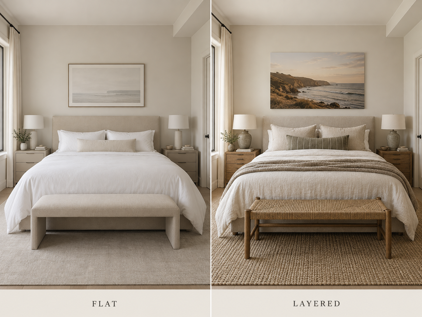
How to mix materials, tones and finishes that feel warm, not busy.
Texture is one of the easiest ways to make a vacation rental feel finished without adding more decoration.
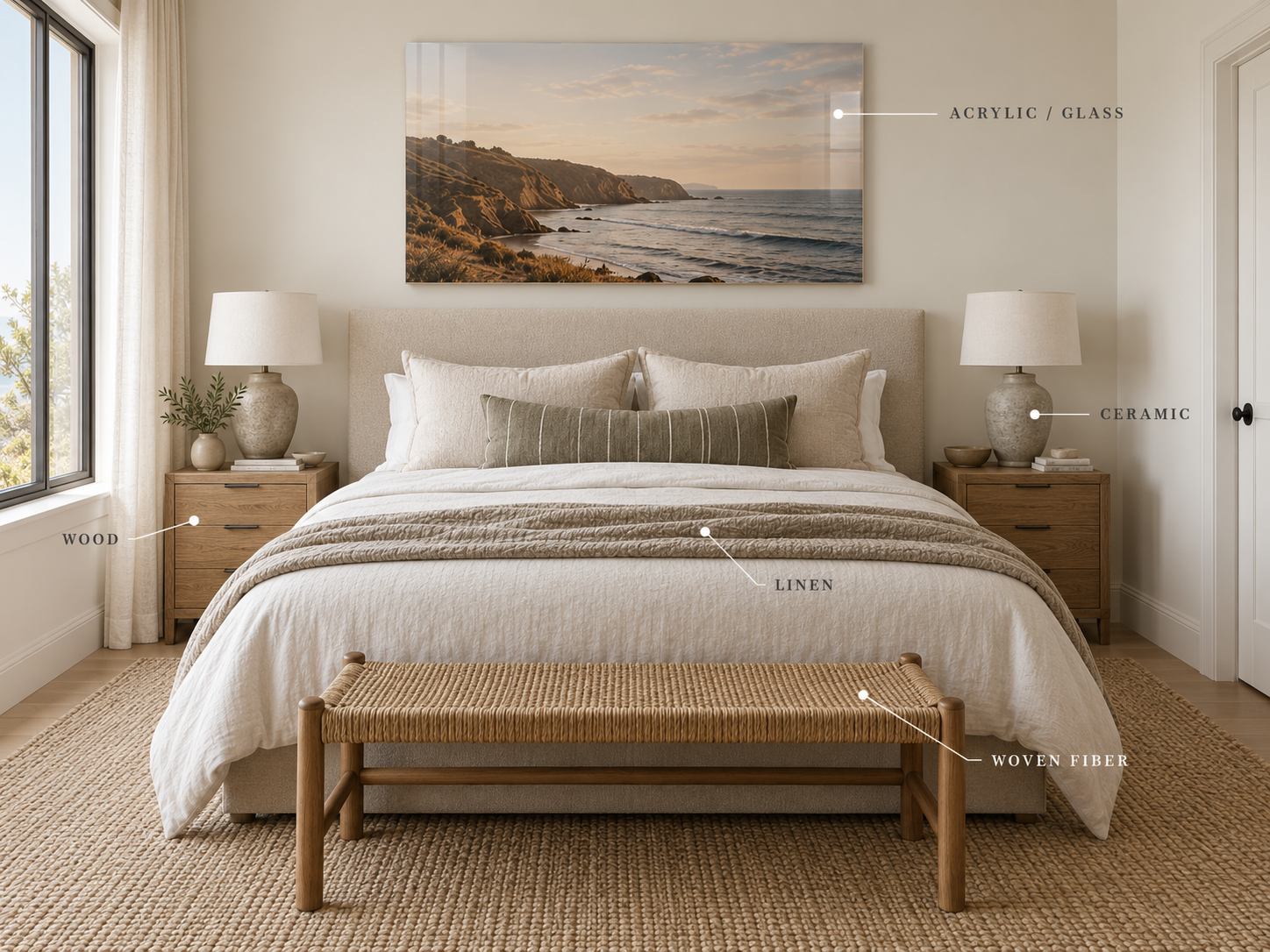
A room can use only a handful of colors and still feel rich when those colors appear across different materials: washed linen, worn wood, woven fiber, matte ceramic, soft upholstery, aged metal.
That variation gives a space depth.
The goal isn't to add as many textures as possible. It's to create enough contrast that the room feels collected and tactile without becoming visually noisy.
Start With a Simple Base
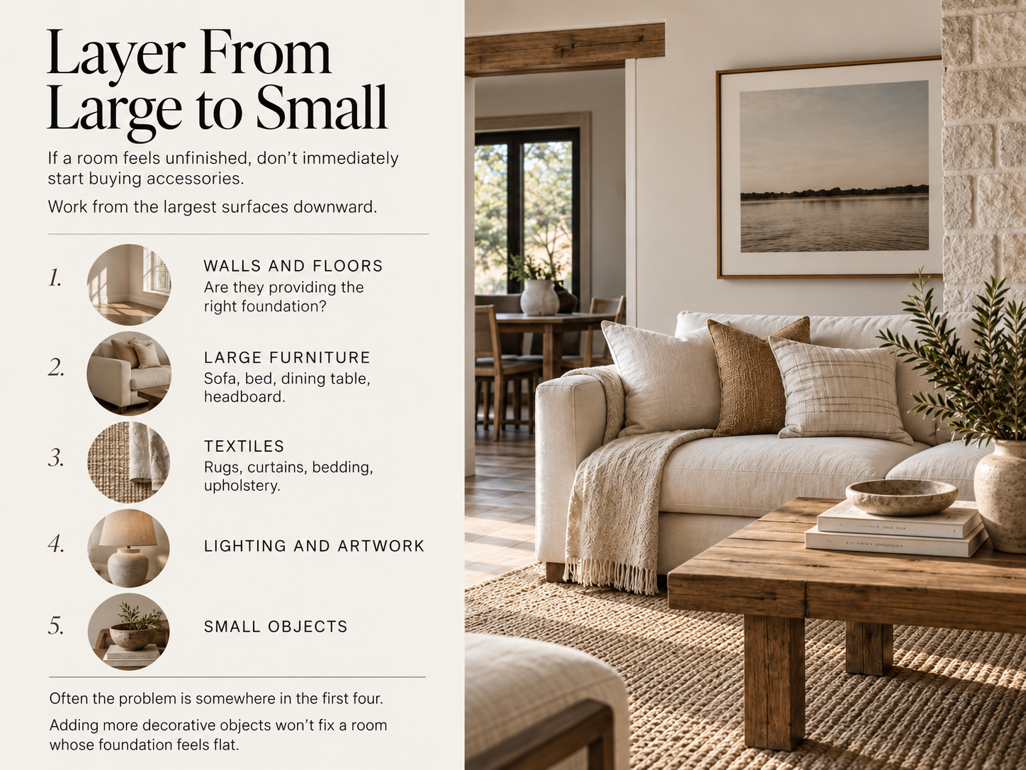
The easiest rooms to layer are usually the ones with a restrained foundation.
That might mean:
warm white walls
natural or medium-toned wood
neutral upholstery
simple bedding
one or two grounding colors
Once the larger surfaces are relatively calm, texture can do more of the work.
Instead of introducing another color or pattern every time the room feels unfinished, ask whether it simply needs another material.
A cream sofa beside a cream wool rug can still have plenty of dimension because the surfaces respond to light differently.
Same color family. Different texture.
Think in Materials, Not Just Colors
When people decorate a room, they often focus first on color.
Try thinking about the material mix instead.
A bedroom might contain:
Linen — bedding
Wood — nightstands
Wool — throw
Ceramic — lamp
Glass or acrylic — artwork
Metal — hardware
Woven fiber — bench or basket
None of those elements need to be dramatic individually.
Together, they create depth.
A room filled with beige can feel sophisticated and tactile—or completely flat. The difference is often the materials.
Mix Smooth and Textured Surfaces
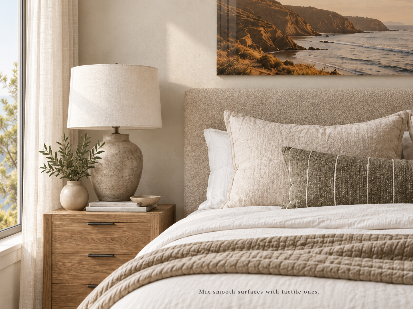
One of the simplest ways to create contrast is to pair something smooth with something visibly tactile.
For example:
Polished acrylic artwork + plaster wall
Smooth cotton sheets + chunky woven throw
Clean wood tabletop + handmade ceramic
Upholstered headboard + crisp linen bedding
Stone counter + warm wood cutting board
You don't need every surface to have obvious texture.
In fact, texture tends to stand out more when it has something cleaner beside it.
Let Wood Add Warmth
Wood is particularly useful in vacation rentals because it adds warmth without requiring pattern or additional color.
But avoid making every wood surface perfectly match.
A room generally feels more natural when the woods are related rather than identical.
You might pair:
light oak furniture
a slightly darker vintage stool
natural woven fibers
a weathered wood frame
Try to keep the undertones compatible, but don't worry about creating a matching furniture suite.
Variation is what keeps the room from feeling overly staged.
Use Fabric to Soften Hard Rooms
Vacation rentals often contain a lot of inherently hard surfaces.
Tile floors. Drywall. Kitchen cabinetry. Glass. Stone counters. Metal fixtures.
Fabric helps counterbalance them.
In a living room, that might mean an upholstered sofa, substantial curtains, a rug and one well-chosen throw.
In a bedroom, bedding does much of the work.
Instead of piling on decorative pillows, create interest through subtle differences:
washed cotton sheets, linen duvet, woven lumbar pillow, wool blanket.
The bed feels layered without feeling overdecorated.
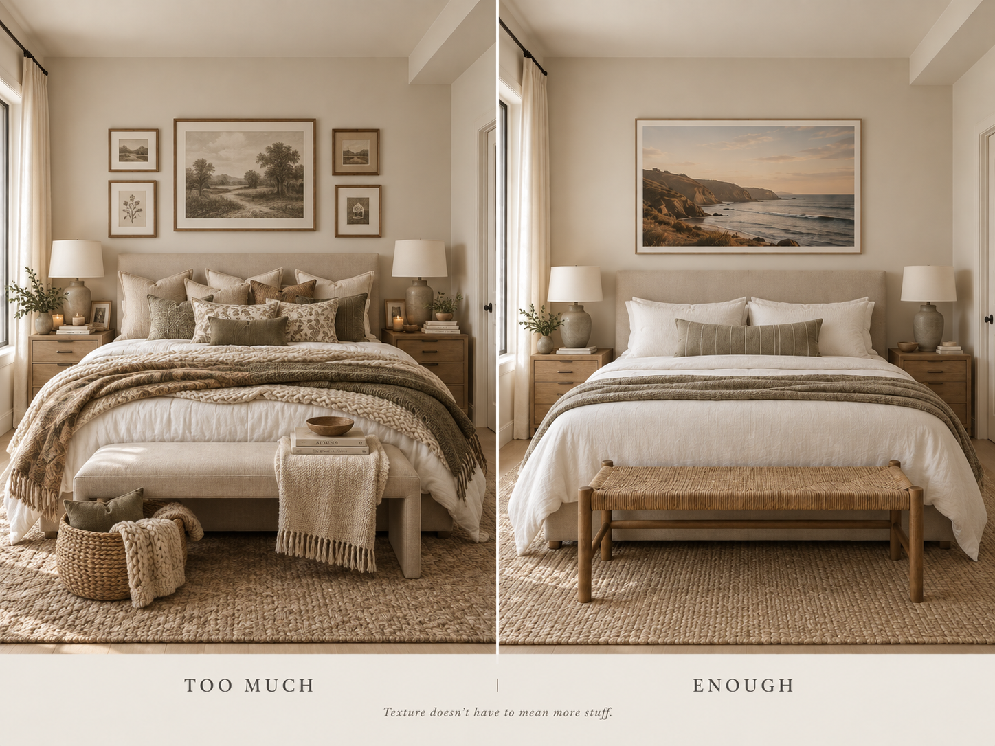
You Don't Need More Pillows
This is especially worth remembering in a rental.
Texture does not have to mean adding objects.
Five decorative pillows, three blankets and several baskets may technically create layers, but they also create more things for guests and cleaners to move.
Instead, let the necessary pieces carry the texture.
Choose a bedspread with visible weave.
Use a substantial upholstered headboard.
Choose a lamp with a ceramic or plaster finish.
Add a rug with natural variation.
Hang artwork with a material presence of its own.
The best rental design often makes fewer objects work harder.
Repeat Materials Around the Room
A room feels intentional when a material appears more than once.
If you introduce blackened metal in a lamp, for example, repeating a small amount of it in cabinet hardware or a curtain rod can make the choice feel connected.
The same applies to:
wood tones
woven fibers
linen
aged brass
ceramic
stone
You don't need exact matches.
Think of it as an echo.
A little repetition helps separate layered from random.
Vary the Scale of Texture
Texture has scale just like pattern does.
A chunky boucle chair has a strong texture.
Linen has a finer one.
Natural wood grain sits somewhere in between.
If every surface has a heavy, obvious texture, the room becomes busy even if the palette is neutral.
Instead, combine different scales:
one substantial texture
a few medium textures
several subtle textures
For example, a heavily woven rug can be balanced by smoother upholstery, crisp bedding and a simple plaster lamp.
Everything doesn't need to shout.
Add Something With Age or Imperfection
Completely new interiors can sometimes feel flat because every surface has the same level of perfection.
One element with age or irregularity can change that.
A vintage stool.
An old wood bench.
Hand-thrown pottery.
Weathered stone.
A slightly imperfect woven basket.
A photograph of an elemental landscape.
These pieces introduce something difficult to manufacture artificially: variation.
You don't need to turn a rental into an antique shop.
Usually one or two pieces are enough.
Keep the Palette Tighter as Texture Increases
The more texture you introduce, the less color variation you may need.
A room with linen, wood, stone, wool, ceramic and woven fiber already contains plenty of visual information.
Keeping those materials within a relatively narrow palette allows guests to notice the differences without the room feeling chaotic.
That doesn't mean everything needs to be beige.
You might use:
warm white
sand
tobacco
charcoal
olive
weathered blue
The important part is restraint.
A limited palette gives the materials space to show.
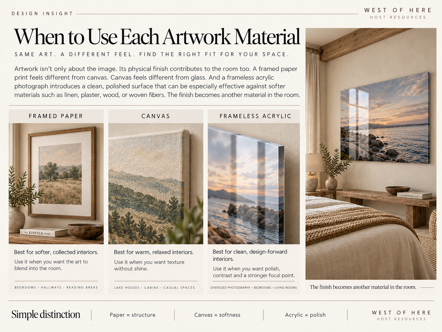
Use Artwork as Part of the Material Palette
Artwork isn't only about the image.
Its physical finish contributes to the room too.
A framed paper print feels different from canvas.
Canvas feels different from glass.
And a frameless acrylic photograph introduces a clean, polished surface that can be particularly effective against softer materials such as linen, plaster, wood or woven fibers.
That contrast is part of why artwork can finish a room even when nothing else changes.
Think of the artwork as another material in the room—not something added after the design is complete.
Avoid the "Theme Room" Trap
Texture should reinforce the location without turning it into a theme.
A coastal rental doesn't need rope lamps, seashell décor and signs about the beach.
Instead, use materials that naturally make sense there:
linen
weathered wood
woven grasses
washed cotton
stone
photography of the surrounding landscape
Likewise, a mountain property might lean toward wool, leather, darker woods and stone without filling the room with literal mountain motifs.
The strongest sense of place usually comes from materials and atmosphere rather than symbols.
A Simple Texture Formula
For a bedroom or living room, try incorporating at least four or five distinct material families.
For example:
Wood + linen + woven fiber + ceramic + glass/acrylic
Or:
Stone + wool + leather + wood + metal
They don't need equal representation.
One may dominate while the others appear in smaller amounts.
What matters is that the eye encounters some variation as it moves through the room.
Know When to Stop
A good layered room still needs empty space.
Not every table needs an object.
Not every chair needs a pillow.
Not every corner needs a basket.
Negative space is what allows texture to register.
When a room feels almost finished, try removing something before adding something.
Often that is the final layer it needed.
The Takeaway
A warm, memorable rental doesn't require more décor.
It usually requires better contrast between the things already in it.
Mix smooth with rough. Soft with hard. New with weathered. Matte with polished.
Keep the palette restrained, repeat materials subtly, and let a few tactile elements carry the room.
The result should feel considered without feeling designed to death.